Friday, June 29, 2012

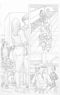
Kevin Nowlan: Finally, The Man-Thing Graphic Novel!


Some new art coming out from the great Kevin Nowlan.
When I do my nest Inspiration Week. I will have to include him.


Keep reading and  +1 me. Share with your friends. Please comment. Just create!

copyright 2012 H. Simpson.

Top 10 Amateur Lettering Mistakes

Top 10 Amateur Lettering Mistakes

Nate Piekos warns amateurs not to make these mistakes by helping them see what them look like.
Check out his web-site Blambot.

Number 5 should be "INconsistent"!


to be continued…

read next - How to Copyright Your Art and Comic Book Creations
previous - What Makes You Beautiful?

Keep reading and follow me. If you have found this helpful, please let me know and share with other creators. Are the explanations clear and complete? Feel free to ask me questions.

Remember… Just Create!

Copyright 2016 H. Simpson

If you are interested in further expanding your knowledge, then I recommend these books.

When you purchase a book by clicking the link below, I get a piece of the action and helps me to continue doing this blog. Support an artist today.

Friday, June 22, 2012

Marvel Universe Sketch Cards

I Like Drawing Sketch Cards

Spider-Man sketch card

Here's one of 100 sketch cards I have in the Marvel Universe 2011 trading card set from Rittenhouse Archives. My first and I would like to do more sketch cards in the future.

I want to thank the people who have be giving me +1s. It's good to have your support.

I would definitely like to get your reactions to this blog, so the communication isn't always one way.

Let me know what you think. It would definitely keep me encouraged to know that we could start some sort of community here.

The Spider-man world movie premiere is in Rome tonight.

I don't know why Blogger hides the dock, thus forcing me to beg. Sheeesh!) Please use the hidden dock on the right to follow and subscribe to me. I also would like to see your comments. Is this helpful to you? Are the explanations clear and complete?

For my readers in other countries you can now translate this blog from the dock. I know you're out there, so please comment.

Keep reading and  +1 me. Share with your friends. Please comment. Just create!


Wednesday, June 20, 2012

What Makes You Beautiful Speech Balloons?


Word Balloons and Lettering for your Comic Book, Comic Strip and Graphic Novel

Comic Book Speech Balloons and Lettering

You are going to be in one of three situations concerning lettering:

1. You get a plot from a writer/co-writer. In which case, you won't know the exact dialogue ahead of time.

Typically when you do your art you should leave about a third of the panel space at top for word balloons. That doesn't mean you leave empty space, it means you compose your scene so no vital information gets covered.You want to make your lettered page beautiful.

Here's a couple of pages I did from a plot. You can see that I've mostly left space at the top of the panels.
pencil art comic book page
Panel 3 is a little tight above her head.

pencil art comic book page
Panel 2 is tight above their heads, however there is plenty of space on each side as an alternative.

2. You get a full script from a writer/co-writer. Now you do have the dialogue and captions. 

Now you can immediately consider the balloon placement when you do your thumbnails and layouts.

3. You are writing this yourself. Now you do know the dialogue and captions and most likely you keep changing it as you go along. Creative people… sheesh!

In any case you are still considering the whole page design with the balloons. There may not be a written script, as some artists start conceiving the story while they do their thumbnails. Which is what I do when I do the thumbnails.

I've included approximate balloon placements in my page design.

to be continued…

Comic Book Grammar & Tradition

BETTER LETTERER: Comic Lettering Tips

read next - Top 10 Amateur Lettering Mistakes
previous - Introduction to Speech Balloons

Keep reading and follow me. If you have found this helpful, please let me know and share with other creators. Are the explanations clear and complete? Feel free to ask me questions.

Remember… Just Create!

Copyright 2016 H. Simpson

If you are interested in further expanding your knowledge, then I recommend these books.

When you purchase a book by clicking the link below, I get a piece of the action and helps me to continue doing this blog. Support an artist today.

Tuesday, June 19, 2012

Introduction to Speech Balloons and Lettering for Comic Books

Word Balloons and Lettering for your Comic Book, Comic Strip and Graphic Novel

Okay, it looks like I can get back to a regular blogging schedule.

This is an introduction to word balloons and lettering.

I started learning lettering by hand when I began my career. I quickly decided I rather spend my time drawing. I didn't enjoy hand lettering. However, I did make sure I did the balloon placements whenever I could. Every artist should do this if you are not lettering your own work.

As an artist the word balloons should be considered a part of the page design and not an after thought.

If you are working with a writer from a plot, then you can't really incorporate the balloons into your layout. After the script is written make sure you do the balloon placements.

If you are the writer or get a full script from the writer, then you should make the balloon placement a consideration in your page design.

I do the lettering with the computer now, so I'll be discussing that. 

Here's how to hand letter comics.


Until tomorrow take a look at this fine example of hand lettering by Todd Klein.

He may still have some prints available. Check out his blog. Tell him I sent you.


OOHH my! I just found this minutes after I posted my blog, by Chris Oatley about balloon placement. Consider it a preview of what I'm going to cover.

BONUS LINK!


to be continued…

read next - What Makes You Beautiful?
previous -  Free Form Panel and Page Design

Keep reading this blog. Share with your friends. Please comment.

Remember… Just create!

Copyright 2016 H. Simpson

If you are interested in further expanding your knowledge, then I recommend these books.

When you purchase a book by clicking the link below, I get a piece of the action and helps me to continue doing this blog. Support an artist today.

Saturday, June 16, 2012

Saturday Morning Inspiration - E9L

E9L

I enjoy the way emotion is communicated in this art and that there is some more story to tell.

See more E9L on Tumblr.


Keep reading and  +1 me. Share with your friends. Please comment. Just create!


Friday, June 15, 2012

Friday Morning Inspiration - Barry Windsor-Smith

Barry Windsor-Smith

I enjoy his Pre-Raphaelite style most of all.

Check out his official web-site.


Keep reading and  +1 me. Share with your friends. Please comment. Just create!

If you are interested in further expanding your knowledge of this artist, then I recommend these books.

When you purchase a book by clicking the link below, I get a piece of the action and helps me to continue doing this blog. Support an artist today.

Thursday, June 14, 2012

Thursday Morning Inspiration - Caravaggio

Michelangelo Merisi da Caravaggio


Italian artist active in Rome, Naples, Malta, and Sicily between 1593 and 1610.
This the guy who made want to learn what is Chiaroscuro?

Check out his web-site.

The Sacrifice of Isaac

Madonna del Rosario

The Calling of Saint Matthew

The Incredulity of Saint Thomas

St. Francis in Ecstasy

Supper at Emmaus

Keep reading and  +1 me. Share with your friends. Please comment. Just create!
If you are interested in further expanding your knowledge of this artist, then I recommend these books.

When you purchase a book by clicking the link below, I get a piece of the action and helps me to continue doing this blog. Support an artist today.

Wednesday, June 13, 2012

Wednesday Morning Inspiration - Henry Clark

Henry Clark


His use of line, composition and light and dark amazes me.


Keep reading and  +1 me. Share with your friends. Please comment. Just create!


Tuesday, June 12, 2012

Tuesday Morning inspiration - J. C. Leyendecker

J. C. Leyendecker

His art is so great!

Learn more about him here.


Keep reading and  +1 me. Share with your friends. Please comment. Just create!
If you are interested in further expanding your knowledge of this artist, then I recommend these books.

When you purchase a book by clicking the link below, I get a piece of the action and helps me to continue doing this blog. Support an artist today.

Monday, June 11, 2012

Monday morning inspiration - Arthur Adams

Arthur Adams

I enjoy his incredible detail and compositions. Check out his web-site.


Keep reading and  +1 me. Share with your friends. Please comment. Just create!

If you are interested in further expanding your knowledge of this artist, then I recommend these books.

When you purchase a book by clicking the link below, I get a piece of the action and helps me to continue doing this blog. Support an artist today.

Tuesday, June 5, 2012

Still Here

Sorry for the erratic schedule lately. I've been swamped lately.


Here's some Frank Cho art that inspires me.


Friday, June 1, 2012

Free Form Panel and Page Design for Comics and Graphic Novels


How to Become a Comic Strip, Comic Book and Graphic Novel Artist


Let's look at a few examples of how to make decisions for a free form designed page based on story, action, anchor image and time progression.

Making decisions based on story.
If you have a very quiet or character driven story, you may decide to use smaller and square panels to make the story feel more intimate.

A story with an epic scale may use larger panels and more horizontal panels to give a sense of grandeur and large vistas.

An action story may have a combination of small panels and large panels to contrast the pedestrian and active or dramatic moments.

© Chris Ware

A nice quiet page of normal events.


The Man who could fly by Will Eisner
© Will Eisner

The last page invokes sadness by designing the page to have the panels represent eyes that seem to be crying.

© Will Eisner

This page is designed to give the readers the sense of looking through the files with the character.


Making decisions based on action and psychological thrillers.
A few different options are available to you.
Use slanted panels where there is action and standard square and rectangles where there is not.
Design the panels to flow with the action.
May use vey haphazard and irregular panels to reflect the chaos or mental state of characters.

art by Joe Madureira
© Marvel Comics 

art by Alex Toth
© DC Comics

© Chris Ware

Awesome page design reflects the mental and emotional state of the character.


Making decisions based on anchor image.
The anchor image is the one image you decide to build your page around to hold it together.

That image can be an active single figure or a close-up. It can also be a dramatic moment and built around a scene.

art by Walt Simonson
© DC Comics

Here the anchor image is the structure. Excellent page design. The structure is designed to be seen first yet it moves your eye to each panel.


Making decisions based on time progression.
This one is the trickiest and where you can be very creative. 

So far I've kept content separate from the design. In this case the design decision to manage time can be altered by the content. As I pointed out earlier film and video are still frames projected at a rapid rate to give the illusion of movement. Panels and gutters are used to give the illusion of time passing. I'll get into this later when I start dealing with content. Page design and panel layout do not decide the content and meaning.

Let's say you decide to use 4 small square panels to condense time. The same 4 square panels can show either:

  • quick action
  • simultaneous events
  • stretch out an action
  • no temporal transitions - just a series of cuts to object of attention in the same scene.

The gutters can be widened or condensed to indicate time has passed at different rate between panels. Large gutter means more time has passed between panels. Smaller than normal gutter can indicate a shorter time passage between panels.

© Walt Simonson

Simultaneous events shown.


Now this would seem to be a good time to segue into content and it looks like I have set it up that way, but alas such is not the case.

I still have balloons, captions, sound effects, actions, expressions, symbols, glyphs, feelings and emotions to discuss.

Next… word balloons.

read next - Introduction to Speech Balloons
previous - Review Panels in Comics and Graphic Novels

Keep reading and follow me. If you have found this helpful, please let me know and share with other creators. Are the explanations clear and complete? Feel free to ask me questions.

Remember… Just Create!

If you are interested in further expanding your knowledge, then I recommend these books.

You can support this blog when you purchase a book by clicking the link below, I get a piece of the action and helps me to continue doing this blog. Support an artist today.

copyright 2012 H. Simpson